St. Louis City County Merger — Are We Too Close to Be Objective?

St. Louis City County Merger — Are We Too Close to Be Objective?

Gary William Kreie

Do we believe the Koreas will be better off if they reunite?  North Koreans might say, “My thought-police brother would become unemployed, and there is more crime in South Korea that we don’t want here.”  South Koreans might say, “My taxes would go up to build roads in the North.”  But we would say to them — hey, Koreans, wake up! You’re missing the forest for the trees.  It’s the opportunity of a lifetime. Think longer term. Think how great a single United Korea could be for your children and grandchildren.

How about Germany?  They merged East and West Germany into one country again.  Has it been perfect?  No.  Is there a groundswell to go back to splitting into East and West Germany as separate countries again?  No.  They still believe their re-merged Germany is better.

So why do we think our own situation is different?  Why are so many St. Louisans so sure that if we merged the City and County, in ten years we would wish they were separate again?  Are we too close?  Are we missing the forest for the weeds?

No plan is perfect.  And we can still propose some changes before the vote.  But more importantly, we, our children, and our grandchildren will be able to make changes after the vote too.  For the whole region.  We could even decide it isn’t working and vote to split again — although no metro since 1876 has voted to go back to fragmentation as far as I know.  (Thank you 1876 ancestors. For nothing.)

And what about America itself.  This isn’t like re-merging a slave region and a non-slave region as we did in the Civil War.  We are not facing an issue anywhere near that magnitude.  Instead of slavery, our middling controversies just seem to be — do we want one person in charge of directing the police, or 50.  Do we let a politician stay in power at the top a few months longer or not.  What’s the best way to generate the same tax revenue.  Not exactly slavery-level issues. Think long term.

Maybe Better Together should have suggested we call ourselves The United States of Missouri, instead of just a new St. Louis.  It might have engendered a sort of patriotism for the region and more of a long term outlook.  We need a Hamilton to get us to see the value of becoming a single city just as the states joined to be a single nation — different than the old ways of Europe.  

And thank God Lewis and Clark didn’t come back from Louisiana territory and tell Jefferson he got hoodwinked, with words like: — 

“Hey, Thomas, don’t merge Louisiana into the rest of the country.  There is no water route to the Pacific, so there is no way these Western lands could ever be developed.  You’d have to have a science fiction miracle like a mechanical horse that uses belly fire to roll on some kind of level track to get people and supplies to the Western lands.  Yeah, like that would ever happen.  There are big mountains in the way.  Yep, Tom, sell it back. Sell it back now before Napoleon realizes it’s a lemon.  Merging our country with that great desert would just drag these seventeen United States of America to ruin.”  – Lewis and Clark

It is astonishing how many government agencies in St. Louis — special, local, state, and federal — already serve the whole region effectively merged without regard to city/county lines.  Here are just some of the government agencies that I thought of.   I’m sure there are more.  

  • Metropolitan Sewer District
  • Great Rivers Greenway
  • Zoo, Museums, Science Center, Symphony
  • Forest Park
  • Gateway Arch
  • Amazon Pitch
  • NGA Pitch
  • St. Louis Area DOT, Highways, Interstates
  • Major Case Squad
  • East-West Gateway Council of Governments
  • School Exchanges
  • Libraries
  • Metro Buses
  • Congressional Districts
  • Convention Center
  • Domed Stadium
  • Explore St. Louis
  • St. Louis River Port Authority
  • St. Louis Terminal Railroad Association of St. Louis
  • Weather Bureau
  • St. Louis region NLRB
  • Missouri Conservation Department – St. Louis
  • Missouri State Parks and Historic Sites – St. Louis Region
  • US Small Business Administration – St. Louis
  • St. Louis District US Army Corps of Engineers
  • St. Louis Federal Reserve
  • Federal Courts
  • St. Louis local FAA
  • Airport  
  • University of Missouri – St. Louis
  • St. Louis Community College

In fact, there are only a few parts of government left to merge, namely local political fiefdoms, taxing areas, and crime prevention. But those are the ones holding back the entire region.

Imagine that we do nothing.  We wait another 30-40 years until another generation, or maybe two more generations, come and go.  We become our parents and grandparents who tried to merge but failed, and watched their kids choose jobs in more forward-looking cities whose past leaders didn’t make the mistakes ours made.  Those cities are better set with broad reach governments to quickly represent the concensus of the region when going after big opportunities or addressing big regional issues to make the lives of their future citizens better.  And they control resources at a high regional level to be able to follow through on big promises.  We will stay the forgotten rust belt town know nationally only for crime, and only visited by national media when we have a major crime, large disaster, or they need a feel-good story about someone beating the odds of actually living in this place.

Now Imagine a merged St. Louis ten years from now where the word is out about us. Average full metro home value (currently $167,100 per Zillow) climbs to merely the current level of metro Minneapolis ($269,200 per Zillow), say.  The approximately one million metro area homes would add over $100 billion in appraised wealth to current homeowners. School tax rates could be lowered to raise the same amount of money. A newly merged St. Louis would be in line to be the next hot city on the national stage.  Our kids choose to live here.

If we merge now, the mere fact that this generation finally got accomplished what previous generations had failed to do so many times, would impart a new vigor into the whole region.  St. Louis City could again be the flagship for not only our great metro, but the entire Midwest, at the confluence of ideas and actions from North and South, as well as East and West.  We are the place of great conflict, great invention, and great discussion for the nation. Dred Scott, Rock and Roll, Black Lives Matter. We have the leaders. We just need a structure that let’s them lead.  

St. Louis needs to join the list of cities the nation sees as a truly great place to live and work.  Think Long Term. See the entire forest. Merge the City and the County into a single great American city.

Crime & Home Prices – 50 Largest US Metros

Crime & Home Prices – 50 Largest US Metros

Overview

This report looks at the correlation between total crime (violent crime and property crime) and recent home prices in the 50 largest metro areas in the United States.  The study uses metropolitan statistical area (MSA) level data and zip code level data to minimize inconsistency with respect to inclusion or exclusion of suburbs of the ranked towns – a major flaw of city limit (“city”) rankings.  This study looks at data from full metro areas, metro suburbs, and metro urban areas.  For this study, the urban zone is the defined as the inner 20% of the metro area by population.  Suburbs are defined as the outer 80% of the metro area by population.

Urban experts warn that it is a common blunder in social science to assume that correlations imply cause-and-effect.  Any correlations could come from a common source, rather than cause-and-effect.  Still, we recognize that real estate sites feature crime as a major statistic they say people should consider when deciding where to live.  And popular choices on where people choose to live bid up home values.

The crime and home price data for this study comes from three sources: 2015 FBI Uniform Crime Reporting Table 6 for full metro crime data, the website Moving.com for zip code level crime index data, and Zillow.com for zip code level average home prices and metro area average home prices.  (Note: Moving.com just recently suspended inclusion of crime data on their web site for unknown reasons.)  US Census Bureau data is used to identify MSA zip code area latitudes and longitudes.  For this study, urban data is computed from the zip code zones closest to the metro area core-city City Hall and whose combined populations make up the inner 20% of the metro population.  Suburban data is computed from remaining zip codes to the edge of the metro area as defined by the Census Bureau and OMB MSA definitions.

The urban crime index was computed using the Moving.com formula by combining zip code crime indexes, weighted by population, from the inner 20% of each metro area.  Suburb crime index was computed from FBI Table 6 full MSA data, and the urban crime index from above using the formula: Suburban Crime Index = (MSA Crime Index – 0.2 * Urban Crime Index) / 0.8.  This indirect approach provides the suburb crime index that, when combined proportionally with the urban index, yields the FBI Table 6 full metro index.  (For any blank entries in 2015 FBI Table 6, data from the most recent years was inserted.)


Full MSA Rankings and Scatter Plot

First consider full metro area data.  The three charts below show crime and property value data for full metro areas.  The Total Crime indexes are computed using the Moving.com formulation from FBI Table 6 data.  The formula adds the crime counts of the seven FBI crime categories and normalizes to the US crime average pegged at 100.  The FBI published a crime index with this formulation until 2004.  A crime index of 200 means the area has double the US average total crime.  50 means half the US average.  The points on the scatter plot are connected with lines (left to right) just as a visual aid.

Figure 1 Full Metro Crime Rank

Figure 1.  Full Metro Areas Total Crime Index compared to US Average of 100.

 Figure 2 Full Metro Home Values

Figure 2.  Full Metro Areas Average Home Values

 Figure 3 Full Metro Scatter Plot

Figure 3.  Scatter Plot.  Full Metro Areas Average Home Values vs Full Metro Crime Index


Full Metro Data Observation

At the full metro level, there is little association between home values and crime looking at the trendline and correlation between home values and crime.  Decisions on where to live, metro to metro, are apparently not driven by overall metro crime levels.

This could be because the public does not believe crime is a major factor they should consider when seeking to move to a new metro area.  Or it could be that the public is not aware of metro area crime data, compared to widely publicized “city limit” crime rankings.  The public may be equating city crime rankings with metro rankings in their minds without realizing that there are significant ranking differences between the two.


Urban and Suburbs Rankings and Scatter Plots

The following plots compute crime and home price numbers separately for metro inner urban cores (inner 20% by population), and suburbs (outer 80% by population).

Figure 4 Urban Crime Rank

Figure 4.  Metro Urban Areas Total Crime Index compared to US Average of 100.

Figure 5 Suburban Crime Rank

Figure 5.  Metro Suburban Total Crime Index compared to US Average of 100.

Figure 6 Urban Home Values

Figure 6. Metro Urban Area Average Home Values

Figure 7 Suburban Home Values

Figure 7.  Metro Suburban Average Home Values

Figure 8 Urban Crime - Urban Home Values Scatter Plot

Figure 8.  Scatter Plot. Urban Crime Index vs Average Urban Home Values

Figure 9 Urban Crime - Suburban Home Values Scatter Plot

Figure 9.  Scatter Plot. Urban Crime Index vs Average Suburban Home Values

Figure 10 Suburban Crime - Suburban Home Values Scatter Plot

Figure 10.  Scatter Plot. Suburban Crime Index vs Average Suburban Home Values

Figure 11 Suburban Crime - Urban Home Values Scatter Plot

Figure 11.  Scatter Plot. Suburban Crime Index vs Average Urban Home Values


Urban / Suburban Data Observation.

Here are three observations from the crime and home value data from data split into urban / suburban components for each of the 50 largest metros in the United States.

  1. While there is little correlation between crime in the suburbs and property values in either the suburbs or the urban areas, the same is not true for urban crime. As we might expect, metros with high crime in urban areas has some correlation with low home values in urban areas.

But what is most pronounced in the data is the correlation between urban crime and suburban home values.  Metros with high urban crime indexes correlate even more with low suburban property values, in the top 50 metros, than high urban crime rates correlate with low urban property values.

While not claiming one causes the other, one could reasonably project that a metro with high urban crime will likely have diminished suburban home values, in spite of the safety of the suburbs in that metro.

  1. Another interesting observation is that many metros with poor crime rankings on the urban crime list, such as Detroit and St. Louis, rank well on the suburban crime rankings. This should not be too surprising since suburban crime would have to be very low in those cities to get their full metro crime averages down to the middle of the pack positions they hold in the full metro crime rankings created from FBI Table 6.

One explanation for the big difference for urban vs suburban rankings for metros Detroit and St. Louis may be geography.  Both cities were founded against major mobility barriers – Canada/Detroit River for Detroit, and the Mississippi River/Illinois for St. Louis.  Their core city halls are almost on peninsulas causing extreme metro sprawl away from downtown.  Downtown core for both metros is far from the current metro population centers, and their downtowns are no longer major crossroads for traffic spanning the metro area, leading to urban core decline.  Their downtowns form part of the outer edge of the city boundary elbow, rather than the inner edge of the elbow, such as Chicago or Boston.

  1. “City” crime rankings (using core city limits only) often line up with the urban ranking shown here for many older Eastern cities, since those cites usually encompass only a fraction of their metro areas with the oldest housing in the metro core. When boundaries are defined consistently using Census and OMB defined MSA rules based on population, instead of politically determined city limits, more Western towns fare poorly in crime rankings.

End.

St. Louis: Urban Crime Reduction — Suburban Windfall

St. Louis: Urban Crime Reduction — Suburban Windfall

There are lots of “Most Dangerous Cities” lists published each year that rank inner cities with respect to crime.  But only around twenty per cent of people in large metro areas live in the metro urban core on average.  The other eighty per cent live in the suburbs.  I decided to take on the task of aggregating crime data at the zip code level to compare metro urban core crime vs. suburban crime for the twenty largest metros in the U.S.  And I was curious to see how crime correlated with average home values for large metro areas–one measure of the desirability of a place to live.  The results are revealing.

Methodology.  First, a short summary of the methodology:  All of the analysis is based solely on metropolitan area-wide statistics or summed from zip code level data in the zip codes of the counties that comprise each metro area, and has no association with city limits at all.  All the chart data was summed from three sources accessible by anyone with access to the internet, specifically, web sites tied to the National Association of Realtors, the US Census Bureau data, and the FBI crime tables.  The analysis uses the most recent data available from these sites as of May 2016.  In this analysis, the urban core is defined as the inner twenty per cent, by population, of metro area zip codes closest to the City Hall of the metros’ primary core city.  The suburban statistics are from the remaining outer eighty per cent zip code areas in the doughnut ring surrounding the urban cores of the metro areas, as defined by the Census Bureau using CBSA metro definitions.  Details of the rest of the methodology are included at the end.

St. Louis and the Twenty Largest Metros.  We start by computing a metro-wide crime index for each of the twenty largest metros from the same FBI metro crime categories used by the real estate web site [moving.com] for their zip code crime indexes.  Figure 1 shows the result.  St. Louis metro overall ranks a respectable tenth best for crime using this formula.

MetroCrimeFullMetro

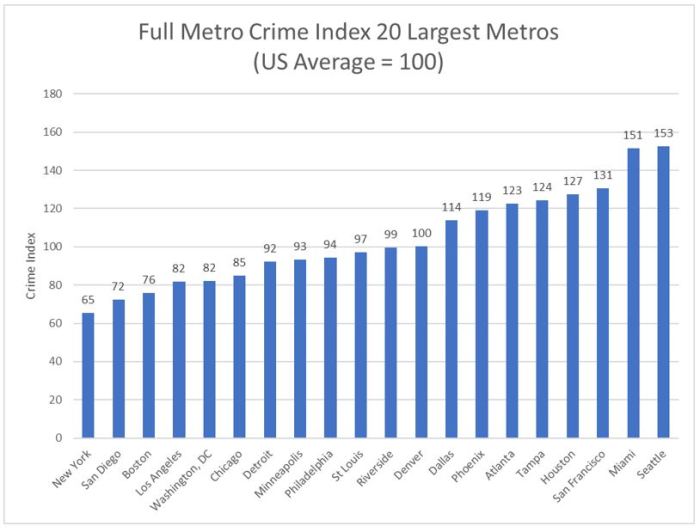
Figure 1.  Full Metro Crime Index—Twenty Largest Metros

Adding a gold line to this chart for average home values and sorting from highest to lowest home values yields Figure 2 below.  There appears to be little or no correlation between home values and crime indexes at the full metropolitan area level.

HomeValuesVCrimeFullMetro

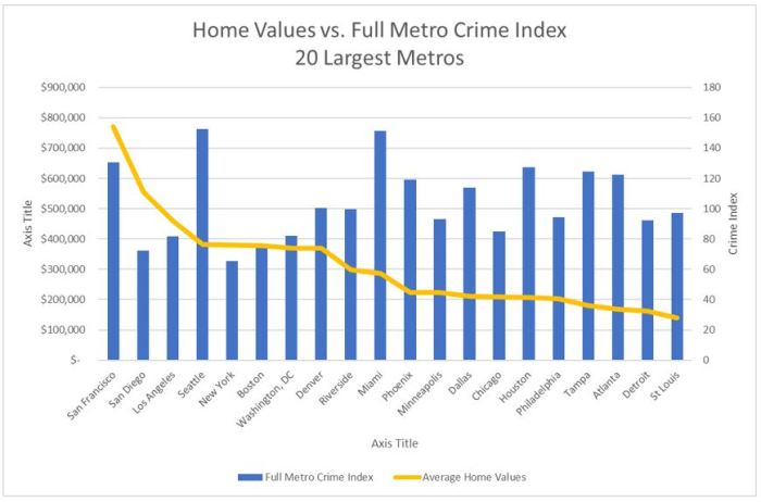
Figure 2.  Home Values vs. Full Metro Crime Index—Twenty Largest Metros

Many things can affect average home values, such as climate, transit options, schools, arts and entertainment, urban vibrancy, walkability, trails and outdoor recreation options, distance from the coasts, and crime.  When it comes to crime, it is not easy to establish cause and effect.  Are low home values a result of high crime, or are crime rates high due to low home values reflecting poverty?  Nevertheless, real estate websites feature crime statistics as a major factor for people to consider when deciding where to live.  At the zip code level, we just assume that higher crime leads to lower home values.  If any population group is able to reduce its crime rate, the real estate web sites will label it as more desirable and will steer home buyers to it, which should raise home demand and home values over time.

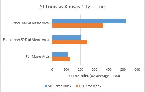
So if we believe that crime is one of the factors affecting home values at some level, we have to ask ourselves why St. Louis and other cities rank poorly in home values if their overall metro crime index is not bad.  The Figure 3 plot below might have the answer.  This plot is sorted by average metro home values again, but it splits metro crime indexes proportionately into two bars–core crime and suburban crime.  The plot also shows the difference between core and suburban crime with the blue line.

HomeValuesVCrime

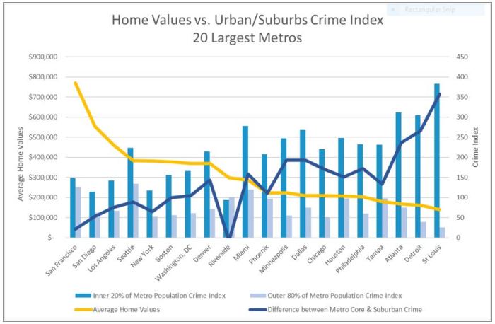
Figure 3.  Home Values vs. Urban/Suburbs Crime Index—Twenty Largest Metros

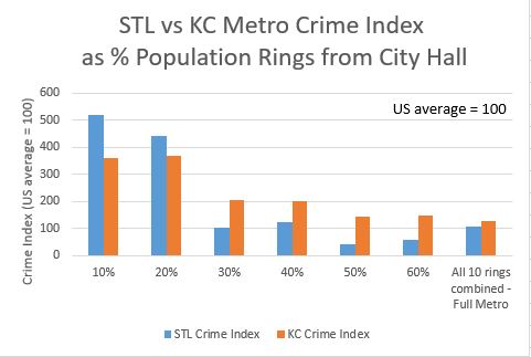
The results show that, along with the lowest home values of the largest twenty metros, St. Louis also has the worst urban core crime index, compared to the other metros.  The chart shows a reasonable correlation between high urban crime and low metro-wide home values.

Figure 4 below is a map of the zip codes of the inner 20% urban core population and the outer 80% suburbs of the St. Louis metropolitan area.

STL_metro_and_urban_map

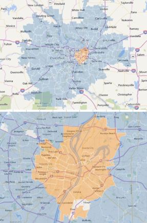
Figure 4.  St. Louis Metro 80% Suburban and 20%Urban Core Zip Codes Maps

St. Louis metro does rank well for low suburban crime.  But suburban crime is low in most of the largest metros.  And those low suburban crime indexes have not resulted in higher St. Louis home values.  In fact, suburban crime indexes for all metro suburbs do not seem to correlate to higher home values in general.

Our low suburban crime could initially be seen by suburban residents as an argument against more regionalism over the fear that core crime could spread to the suburbs.  But a closer look at the data shows that a large difference between urban core crime and suburban crime has an even higher correlation with low metro-wide home values–slightly more than urban crime index alone.  And St. Louis metro area ranks dead last in the difference between the crime index of its urban core and its surrounding suburbs of the twenty largest metros in the US.  A clear inference from the data is that the gulf in crime between the inner core and the outer suburbs is the result of our region’s inability to apply resources, leadership, and crime fighting success of the suburbs to solve problems in our urban core.  The result is the lowest home values of the twenty largest metros.

Pointer to a Path Forward.  While there is nothing we can do to change our local climate or our distance from the coasts to improve home values, we can do something about urban vibrancy and crime.  The data suggests that a cost effective way to raise all metro home values might be to enact a property tax on homes throughout the metro area and apply the funds to lowering crime only in the urban core.  The data implies that the home property tax will be returned to the taxpayer many times over through higher home values. Of course creating better regional governance would make implementation of such a policy much more feasible.

Figure 5 below shows a plot of four large Midwestern cities and where St. Louis stands with respect to them for urban crime and metro home values.  The plot indicates the level to which we could expect average home values to rise if we apply metro-wide resources to reduce urban core crime.

Figure_5_Path_Forward_STL

Figure 5.  A Path Forward for St. Louis?

There are 1.2 million housing units in the St. Louis metro area [proxityone.com].  If St. Louis could move up just one slot in the home value ranking by reducing urban crime, up to Detroit’s level, it could add $21,300 to the average value of each home in the metro area, and add $26.3 billion for all home values combined.  If we could move up to Minneapolis’s numbers over the next twelve years, it could mean an average increase in home values of a whopping $82,100 average per house in the entire metro area, and add over one hundred billion dollars to our metro home value base.

We could use the current numbers of these Midwestern metros as intermediate goals for St. Louis over the next twelve years to help us decide how much metro money to devote to reducing core crime.  Then, if our metro creates a regional plan to directly address our urban crime, we can measure our core crime reductions and home value increases against these metros to see if our plan is on track.

A Proposal.  How much is enough money to devote to core crime reduction to raise metro home values?  If core crime was the sole driver to metro home values, you might say spending $80,000 per house in the metro area is not too much to spend if we were guaranteed the Minneapolis numbers.  But since urban crime is only a significant factor—not the only factor—and since we can probably get huge reductions in crime for far less than that number, we should not have to go to that extreme.  Another way to look at this is to ask: what level of spending on community policing and training, improved education, more jobs and job training, drug treatment, and new public community facilities would finally break the back of crime in the metro urban core—the inner twenty per cent of our metro area on both sides of the river?

A part of the equation will involve breaking the psychology of using guns to resolve conflicts among individuals. Treating gun violence as a community health issue and establishing community centers could allow us to break that psychological cycle of violence.  Also generating jobs for the unemployed in the urban core is crucial, and could be publicly funded if we include skills training that can be applied anywhere in the metro area.  What better way to gain construction skills, for instance, than learning to rehab houses within the urban core?

I’ll leave it up to trained urban planning experts to generate a viable detailed plan for reducing urban crime.  But for now, consider this approach to a twelve-year plan to reduce core crime and raise home values metro-wide.  While police budgets in the urban core cities are currently around one and a half times the budgets of suburban towns per person, the crime challenge at the core of our region is at least four times as great per person for a variety of historical reasons.  Adding $60,000,000 per year total to police budgets in the core cities of the St. Louis region should give an expanded police force time to engage in additional community policing at the street level.  Next, we should consider creating ten thousand jobs at $30,000 per year working infrastructure and rehabbing abandoned homes in the region at a cost $300,000,000 per year.  And adding new facilities for training, treatment, and community centers could cost another $40,000,000 per year.  Total cost would be $400 million per year for twelve years.  Dividing by the 1,236,676 houses in the metro area would add $323 dollars per house per year to average home property taxes, or about 23 cents per $100 valuation per year for twelve years for the current average metro home value of $140,700.  After twelve years, the metro could decide to reduce the funding, or divert some of it to another goal such as core school improvement.  Or, if home values start rising as urban crime is reduced, the tax rate could be lowered and still generate the same level of funds.

If we believe that spending $400 million per year for twelve years would lower the inner core crime down to the Minneapolis levels, and home values would rise to Minneapolis levels as a result, then we could expect to get an average home value rise of $82,100 dollars per house for a home property tax investment of only $3,876 per home on average. ($323 times 12 years) for a total return on investment of over twenty to one.  But if it is only two to one, it will have been worth it.

Conclusion.  I believe the data show that it pays financially for the greater region to invest in solving the metro’s core problems if all portions of the region chip in, including St. Charles County, Jefferson County, and all other metro area counties in Missouri and Illinois.  And the payoff might be huge for home owners throughout the greater regional area.  We could give the effort an identifiable name to help rally support, such as St. Louis MACS–Metro Advancement through Core Security.  It would be funded with a twenty-three cents per hundred-dollar valuation property tax on all homes in the metro counties on average, and it could include a sunset clause to end the program after twelve years.  St. Louis MACS could be roughly patterned after the successful MAPS program that Oklahoma City executed in the late 1990s and 2000s to restore their city center.  MAPS was so well managed and so successful that voters renewed the MAPS tax to address schools after the city core was booming again.  St. Louis could do the same.

#

Methodology Continued.  I began by compiling crime index data down at the zip code level, using publicly available data from Total Crime Risk values found on the real estate web site moving.com, part of the National Association of Realtors.  The site displays a crime index for each zip code computed from a sum of seven of the eight FBI counts of murder, rape, robbery, aggravated assault, burglary, larceny theft, and motor vehicle theft.  The sum is converted to a crime index by comparing it to the national average pegged to an index of one hundred.  A zip code crime index of two hundred, for example, represents double the US crime risk.  This formula is identical to the one the FBI included in crime tables before 2004, the last year they included a crime index.  While we may not be happy with this crime index formulation, it is the one being used by prominent real estate sites to help people decide where to live.

To find which zip codes comprised the inner twenty per cent of the population of each metro area, I started with U.S. Census Bureau tables that listed all zip codes for each metro area, the population of each of those zip codes, and the latitude and longitude of those zip code areas.  With this data, I could determine the zip codes in the inner twenty per cent, by population, of each metro area.

Once I determined the zip code areas for the inner twenty per cent urban core, I retrieved the crime indexes for those zip code areas and used them to computed a single crime index for the urban cores, weighting individual zip code indexes by their population so a zip code with only three people would contribute proportionally less than one with three thousand people.  Then I could compute the crime index for the outer eighty per cent of each metro area as the number that, when combined proportionally with the inner twenty per cent number, yielded the full metro crime index composed of the same crime category counts from FBI Table 6.  Full metro average home values came from realtor.com, owned by the National Association of Realtors.

End.

Three Links to Published versions of this piece or about this piece:

STLStrong http://www.stlstrong.org/urbanreducationsuburbanwindfall

NextSTL: https://nextstl.com/2016/08/st-louis-urban-crime-reduction-suburban-windfall/

St. Louis Post Dispatch Tony Messenger Column: http://www.stltoday.com/news/local/columns/tony-messenger/messenger-finding-a-regional-solution-to-st-louis-crime-problem/article_ba055cf9-7eb7-5617-bb12-ae7de6e45aed.html

Crime Ranking: St. Louis vs. Kansas City

Crime Ranking: St. Louis vs. Kansas City

Midwest Mayors complain that “city” crime rankings are not accurate because cities are defined by city limits, which are determined by politics, not consistent rules of population statistics.  Rust belt cities typically have city limits locked in place encircling a small old inner portion of the metropolitan area and containing few if any low-crime suburbs.  Newer Western cities, by contrast, cast their city limits far out into farm fields where they encircle the majority of their metro low crime suburbs, which dilutes their average crime rates.

OKC_City_Limits_Google_Maps

https://goo.gl/maps/XVnTkkaaGv72

But researchers put both types of cities into the same “city” ranking, and then declare the cities with most crime per resident as the most dangerous.  Since the general public associate cities with entire regions, “city limit” rankings can unfairly paint an entire region as crime riddled while masking growing crime issues in so-called “hot” younger cities.  These rankings tell you almost nothing about personal danger, since any city can change its ranking just by moving a boundary without actually lowering crime.

By contrast, crime rankings based on Metropolitan Statistical Area (MSA) boundaries, instead of city limits, make use of city definitions set consistently, metro to metro, by the Federal government using statistical rules based on population.  For some reason, these more valid MSA rankings are ignored by the media. In 2012, Forbes Magazine switched from MSA crime ranking to a city limits crime ranking, with scant rationale, saying “We used cities instead of larger metropolitan statistical areas, which gave the disadvantage to older cities with tighter boundaries.”

MSAs usually have an inner business cores at their centers, older smaller homes and multi-family homes further out, and suburbs beyond that.  I contend that statisticians could do a much better job of comparing major cities by going down to the zip code level and identifying zip codes in the inner 10%, 20%, 30% etc. of their MSAs for crime statistics.  Then one could compare the inner 10% core of the Pittsburgh metro area with the inner 10% core of the Houston metro area if one was planning to live near downtown.  Or compare the 50% population ring of two metros for folks comparing suburbs.  But that takes some work, and most crime rankers just paste FBI tables into a spreadsheet, combine crime categories into a single score for each city, and then sort on that score.  This is something almost anyone could do in an afternoon.

I decided to take my own advice and see how hard it would be to go onto the internet and address just two cities using the percent of population rings approach to compare crime rates.  I chose to compare St. Louis and Kansas City.  St. Louis is the last old Eastern City as you go West, and KC could be seen as the first Western style city.  In the free 2014 CQ Press Cities Crime Ranking, St. Louis ranked at #5 worst for crime while Kansas City ranked better at #61.  But in the 2014 CQ Press Metro Ranking, the orders were reversed with Kansas City ranking worse at #52, while St. Louis ranked safer at #95.  So I was anxious to see how the plots would show a transition as the data extended further from City Hall.

Method

Here are the steps I used to plot St. Louis and Kansas City crime.  The same steps and data sources (links at the end of the piece) work for all metro areas.

Method for Average Crime index for percent population rings from City Hall.  10%, 20%, etc.

  1. Find zip codes for each Metropolitan Statistical Area (MSA)
  2. Find LAT LONG of City Hall of the primary city of each MSA and each MSA Zip Code area
  3. Compute distance of each zip code from city hall in miles with LAN LONG to mile conversion.
  4. Get Crime Index for each zip code
  5. Get population for each zip code
  6. Determine distance rings containing 10% of the population, 20%, etc.
  7. Identify specific zip codes within each ring
  8. Compute total crime index for each % ring using zip code crime index weighted by population.
  9. Plot crime index for the 10% population ring, 20% ring, etc. as a histogram.

I was able to find free databases online for each of the steps in this approach, but it was a bit tedious copying crime indexes by zip code from one of various neighborhood data realty sites and pasting the indexes into my spreadsheet one at a time.  Professional researchers could probably purchase the entire crime-by-zip-code database in XL format to make that part a lot easier.

I computed the distances from City Hall for 10% of the metro populations, 20%, 30%, etc. at these distances:

STLKCpercents_miles
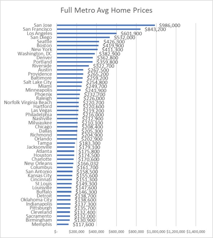
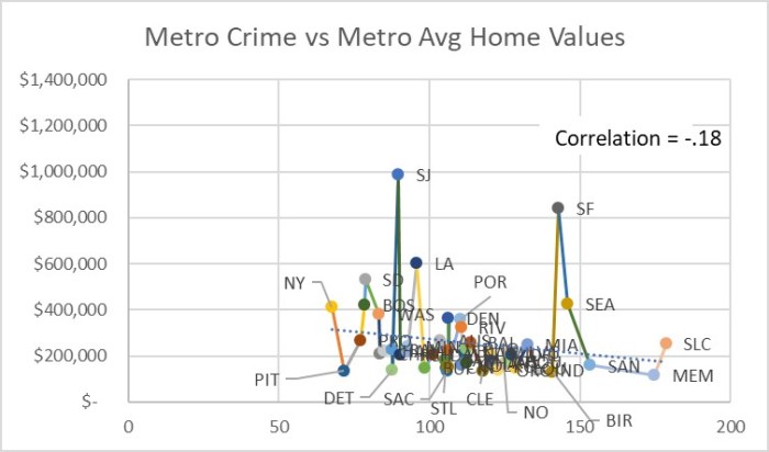
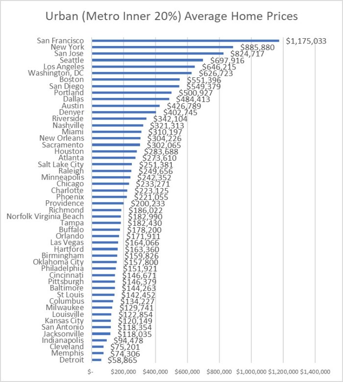
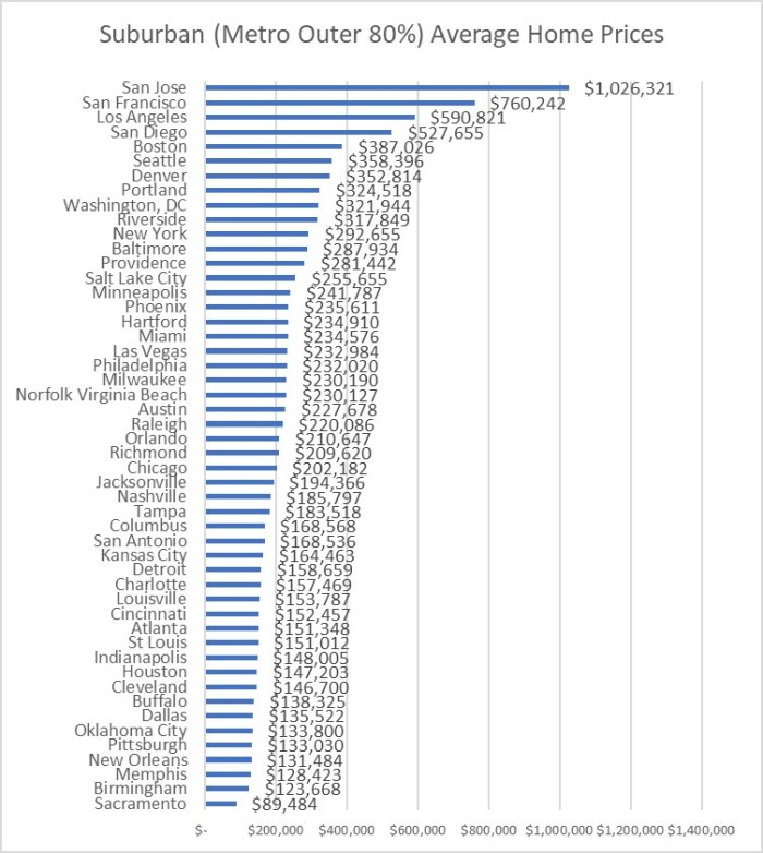
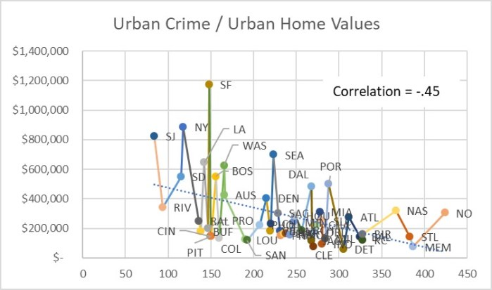
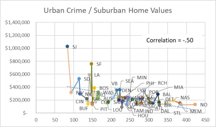
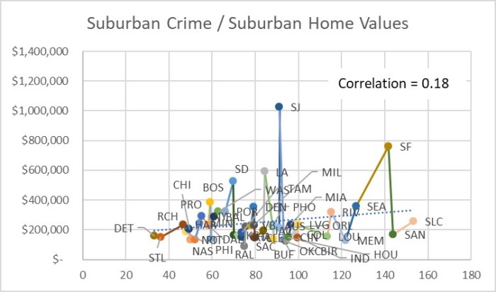
Table 1.  Distance from City Hall where 10%, 20%, etc. of the metro population live.

I realized that since St. Louis and Kansas City metro areas are fairly similar, it would be interesting and pretty easy to go through step 4 above and just plot zip code crime indexes for each zip code as a function of distance from city hall.  The data include zip code areas in Illinois for St. Louis, and Kansas for Kansas City as well as Missouri zip codes.

Results

Here is the scatter plot of zip code crime indexes vs. distance from City Hall for St. Louis and Kansas City.  US average crime index is 100.

STL v KC Zip Crime by Distance.JPG

Figure 1.  Zip Code Crime Index by miles from City Hall for St. Louis and Kansas City Metros.

The website posting the crime index for each zip code said the index is a combination of rape, murder, assault, robbery, burglary, larceny and vehicle theft normalized against a US average score of 100.  So 200 means twice the average US crime.  The counts of each crime category are unweighted according to the web site, so murder counts the same as robbery.

Continuing with the remaining steps to get a histogram of crime indexes by percent of metro area rings, I combine crime indexes within each percent ring.  For this, I weighted the indexes by zip code population, so a zip code with just 3 people would contribute proportionally less than one with 1,000 people within a percent ring.  I collected data up through the 60% ring.  For the full metro numbers, I computed the St Louis and Kansas City crime indexes directly from the FBI data tables.

Here is the crime index histogram for each percent ring of population out to 60% from City Hall.

STL v KC Pop Rings Crime

Figure 2.  Crime Index by 10% rings of population out from City Hall.

And here is what the data looks at the 10% core, the entire inner 50% of the metro population and the full metro.

STL v KC Crime 10 50 100

Figure 3.  Crime Index for 10% core, the entire inner 50% of the metro population, and the full metro.

Since St. Louis and Kansas City are similar in size, the histogram information roughly lines up with the distance scatter plot.  If I was comparing St. Louis to a much smaller or larger metro, the percentage histogram would be more useful.

Here are maps of St. Louis and Kansas City with the Crime Index shown as a number from 1 to 6, where 6 represents crime 6 times the national average.  The links below the maps go to short videos of each map in a circling motion to see around the data pillars.

St Louis Crime Index by Zip

Figure 4.  St. Louis Crime Index by Zip Code.  US average is 1.

https://flic.kr/p/G9QBsb


Kansas City Crime Index by Zip

Figure 5.  Kansas City Crime Index by Zip Code.  US average is 1.

https://flic.kr/p/FnxJMC


Observations

I was surprised at how different the plots turned out between the two cities.  As expected, core areas of both metros have higher crime rates, and suburbs have lower crime rates.  Since the full St. Louis metro crime rate is lower than the full Kansas City metro crime rate, I was guessing that the two metros were similar enough in configuration that St. Louis would come out slightly safer at every percent of population and distance out from City Hall.  Instead I learned that the inner 20% of St. Louis zip codes had around a 20% higher crime index than their Kansas City counterparts.  I was even more surprised to see how much safer St. Louis inner suburbs are than their Kansas City counterparts. The Kansas City crime index was around 40% higher than St. Louis for the 30% through 60% population rings.  The higher suburban crime in Kansas City more than makes up for the higher inner core crime in St Louis to account for the overall higher crime rate in the entire Kansas City metro area.

The crimes per person may be higher in St. Louis inner core because the number of people living there (the denominator) has plummeted over the last 70 years until recently, while the number of people working, driving through, and doing business during the day is still pretty high.  But crime indexes always divide only by the resident count, not the visitor count.  I suspect these patterns may be typical for older rust belt cities where the middle class has moved to larger modern homes in the suburbs long ago, whereas Western cities still have many newer homes close to the central core.  Some cities like St. Louis and Detroit have an additional factor pulling residents westward – a central business district built almost out on a peninsula up against a major barrier – the Mississippi River for St. Louis and the Canadian border for Detroit.

Conclusions

If all the City and Metro crime rankings were replaced with charts like these, planners could make better decisions about the status of crime in major cities.  This approach completely eliminates the city limits as a factor driving a false ranking.  Planners can better see how their metro area stacks up against other metros at similar distance rings when assigning resources to fight crime.  The next step would be to go down to zip code level directly to address specific crime problems within the metro areas.  If publishers must have crime rankings to sell magazines, the full MSA boundary ranking, or the 50% inward stats are more representative of relative crime rates.

References

Links to data sources:

Zip Codes that make up each MSA:

http://www.dol.gov/owcp/regs/feeschedule/fee/fee11/fs11_gpci_by_msa-ZIP.pdf

LAT LONG of each metro – City Hall

https://www.statcrunch.com/app/index.php?dataid=1232319

Zip Code Area LAT LONGS

https://boutell.com/zipcodes/

Convert difference between two LAT LONGs to statute miles

=ACOS(COS(RADIANS(90-A2)) *COS(RADIANS(90-A3)) +SIN(RADIANS(90-A2)) *SIN(RADIANS(90-A3)) *COS(RADIANS(B2-B3))) *3958.756

Crime rating and population size for each zip code

http://www.moving.com/real-estate/city-profile/

Population distance spread from City Hall

http://www.census.gov/population/metro/data/pop_pro.html

Zip code map images

http://www.zipmap.net/Missouri/St._Louis_city.htm

FBI Table 6 to get Full Metro Stats to compute full metro counts 2013

https://www.fbi.gov/about-us/cjis/ucr/crime-in-the-u.s/2013/crime-in-the-u.s.-2013/tables/6tabledatadecpdf/table-6

FBI Table 1 to get Full US Stats to scale computer full metro crime Indexes 2013

https://www.fbi.gov/about-us/cjis/ucr/crime-in-the-u.s/2013/crime-in-the-u.s.-2013/tables/1tabledatadecoverviewpdf/table_1_crime_in_the_united_states_by_volume_and_rate_per_100000_inhabitants_1994-2013.xls

Total Crime Risk Index Used by Moving.com description:

Total Crime Risk – A score that represents the combined risks of rape, murder, assault, robbery, burglary, larceny and vehicle theft compared to the national average of 100. A score of 200 indicates twice the national average total crime risk, while 50 indicates half the national risk. The different types of crime are given equal weight in this score, so murder, for example, does not count more than vehicle theft. Scores are based on demographic and geographic analyses of crime over seven years.

http://www.greenhavenga.org/s/Stereotype-Busting-Some-Bad-Neighborhoods-Have-Lower-Crime-than-Affluent-Neighborhoods.pdf

CQ Press 2014 (2013 data) rankings of safest cities and safest metro areas.

http://os.cqpress.com/citycrime/2013/2014_MetroCrimeRateRankings(LowtoHigh).pdf

http://os.cqpress.com/citycrime/2013/2014_CityCrimeRankings(LowtoHigh).pdf

Forbes Most Dangerous Cities

2011 When Forbes used the MSA Ranking

http://www.forbes.com/sites/johngiuffo/2011/10/03/americas-most-dangerous-cities/#5a2634a11878

2012 When Forbes switched to the City Limits Ranking

http://www.forbes.com/sites/danielfisher/2012/10/18/detroit-tops-the-2012-list-of-americas-most-dangerous-cities/#242169ce11d7

Gary Kreie is a recently retired missile software engineer/manager.